from IPython.display import clear_output
!pip install -U pandas_datareader
!pip install plotly

clear_output()![]()
[CA]: Time Series #1 - Decomposing & Working with Time Series
CA=Competence Afternoon
This CA is originally found on kaggle.com/lundet/.., as we entered a competition to predict cryptocurrency prices - G-Research Crypto Forecasting.
N.B. This blog/notebook is adapted into a Jupyter notebook that’s easier to replicate, that is we don’t use the Kaggle API + GBs of data that was required for said competition.
- Part One - Decomposing & Working with Time Series (theoretical) (
 )
) - Part Two - Predicting Stock Prices (Time Series) using classical Machine Learning ()
- Part Three -Forecasting Cryptocurrency Prices (Time Series) using Deep Learning (PyTorch, Tensorflow/Keras & darts) ()
Moving on to the content! 🤓
Time Series Concepts
Time Series has some important attributes that are unique compared to other data types such as Text, Image and Tabular.
Time Series can be decomposed into multiple other time series that together compose the decomposed one (composition baby!).
| Trend | Seasonality | Combined |
|---|---|---|
 |
 |
 |
As shown above we can build a time series out of a Trend and Seasonality, that means we can also decompose the Combined into Trend and Seasonality.
This can be done in a few ways, mostly either through a additive or multiplicative decomposition.
- Additive means that if we add
TrendandSeasonalitytogether we createCombined. - Multiplicative means that if we multiply
TrendandSeasonalitytogether we createCombined.
But these two are not enough to compose a full time series, usually we have noise too.
| Noise | Trend+Seasonality+Noise |
|---|---|
 |
 |
It seems we’re onto something. But still it’s not really how we usually see time series!
What else is left? Autocorrelation!
Autocorrelation is a correlation between two observation at different time steps, if values separated by an interval have an strong positive or negative correlation it’s indicated that past values influence the current value.
To keep it simple, if a time series is autocorrelated it’s new state has a correlation with a earlier step.
| Autocorrelation | Trend+Autocorrelation |
|---|---|
 |
 |
| Trend+Seasonality+Autocorrelation | Trend+Seasonality+Autocorrelation+Noise |
|---|---|
 |
 |
And there we go! 😎
We got a legit timeseries, pat yourself on your back and be proud. We did it.
Let’s get started with real data… 🧑💻
Installation & Importing
We need to have libraries which allows us to simplify operations and focus on the essential.
pandasis aDataFramelibrary that allows you to visualize, wrangle, and investigate data in different waysnumpyis a math library which is implemented inCandFortranand combined with vectorized code it’s incredibly fast!- This is key in Python as Python is a really slow language.
pandas_datareadergives us easy access to different data formats, directly inpandasplotlygives your plots the next level interactivity that you’ve always wanted
And importing our libraries
import pandas as pd # data processing, CSV file I/O (e.g. pd.read_csv)
import numpy as np  # linear algebra
import pandas_datareader as pdr

from datetime import datetime
Reading Cryptocurrency Data
Using pandas_datareader we can query multiple API:s, and among them Yahoo.
Yahoo as a financial API that follows stocks, currencies, cryptocurrencies and much more!
Let’s see what we can do.
df = pdr.get_data_yahoo('BTC-USD', start=datetime(2020, 1, 1), end=datetime(2022, 1, 1))
df.head()| High | Low | Open | Close | Volume | Adj Close | |
|---|---|---|---|---|---|---|
| Date | ||||||
| 2020-01-01 | 7254.330566 | 7174.944336 | 7194.892090 | 7200.174316 | 18565664997 | 7200.174316 |
| 2020-01-02 | 7212.155273 | 6935.270020 | 7202.551270 | 6985.470215 | 20802083465 | 6985.470215 |
| 2020-01-03 | 7413.715332 | 6914.996094 | 6984.428711 | 7344.884277 | 28111481032 | 7344.884277 |
| 2020-01-04 | 7427.385742 | 7309.514160 | 7345.375488 | 7410.656738 | 18444271275 | 7410.656738 |
| 2020-01-05 | 7544.497070 | 7400.535645 | 7410.451660 | 7411.317383 | 19725074095 | 7411.317383 |
The data seems great, but one should always validate it visually and programmatically.
How about plotting it first?
Plotting can be done in multiple ways, let’s start using the pandas way. 🐼
pandas/docs/plot
Make plots of Series or DataFrame.
Includes options likex,y,kind(e.g.line,barordensity) and much more.
df['Close'].plot()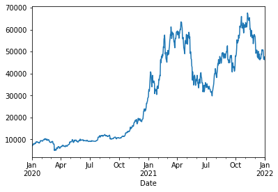
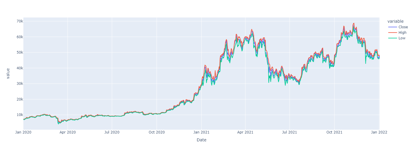
Let’s add some interactivity to this, and plot Low/High on top of that!
Super simple using plotly as the backend! 😎
df[['Close', 'High', 'Low']].plot(backend='plotly')Show plotly chart (as it’s invisible in blog-mode)
You can also plot a candle-stick chart by using
import plotly.graphical_objects as go

fig = go.Figure(data=[go.Candlestick(x=df.index,
                open=df['Open'],
                high=df['High'],
                low=df['Low'],
                close=df['Close'])])
The data does look nice, but we need to figure if there’s any issues in the data.
Graphs might be missing some values that are not clearly visible as there’s so much data. Our final data validation should always be programatical.
Data Validation
Validating that data makes sense and that there’s no errors is very important when you’re building models. Having outliers, errors and other things can lead to some really weird behaviour.
There’s a few tools we can use:
pd.DataFrame.isna:
Detect missing values. Return a boolean same-sized object indicating if the values are NA. NA values, such as None or numpy.NaN, gets mapped to True values.
💡The reverse,notnaalso exists.
df.isna().head()| High | Low | Open | Close | Volume | Adj Close | |
|---|---|---|---|---|---|---|
| Date | ||||||
| 2020-01-01 | False | False | False | False | False | False |
| 2020-01-02 | False | False | False | False | False | False |
| 2020-01-03 | False | False | False | False | False | False |
| 2020-01-04 | False | False | False | False | False | False |
| 2020-01-05 | False | False | False | False | False | False |
Can we we make this more readable?
Yes! Using .any(), or even ‘cheating’ using .sum()
df.isna().any()High False
Low False
Open False
Close False
Volume False
Adj Close False
dtype: booldf.isna().any().any() # 👀FalseLGTM ✅
Next up: Validating that there’s no missing days
This can be done in multiple ways, but for now I choose to use .diff.
pd.DataFrame.diff: First discrete difference of element.
Bonus: Diff can also handleperiodsandaxisarguments,periodbeing how far to diff.
df.index.to_series().diff().dt.days.head()Date
2020-01-01 NaN
2020-01-02 1.0
2020-01-03 1.0
2020-01-04 1.0
2020-01-05 1.0
Name: Date, dtype: float64Ok, so we’ve got a series. Try to validate that no diff is greater than 1 day using a broadcasted/vectorized operation.
hint:
pandasautomatically broadcast operations by operator overloading, e.g.>,+etc
I think we can call quits on the validation part for now.
Let’s move on to different ways we can format the data, a common format is LogReturn.
Transforming Data
Because data is very different moving in time we wish to normalize the data somehow. This can be done in multiple ways, some common ways are:
pd.DataFrame.diffwhich takes the difference between x_1 and x_2
- The negative aspect of this is that the difference is still not scaled
pd.DataFrame.pct_changewhich validates the % differenceLogReturnwhich is the logarithmic return between each time step (x_1, x_2, ..).- Apply a
Scalerwhich scales the data somehow
- Can be
MinMaxScalerwhich scalesMinandMaxto (0,1) or (-1,1) - Can be a
MeanScalerwhich scales the data to have a mean of 0.
… and more.
We’ll start of with LogReturn which is common in forecasting of stocks.
def log_return(series, periods=1):
return np.log(series).diff(periods=periods)df['LogReturn'] = log_return(df['Close'])
df['LogReturn'].head()Date
2020-01-01 NaN
2020-01-02 -0.030273
2020-01-03 0.050172
2020-01-04 0.008915
2020-01-05 0.000089
Name: LogReturn, dtype: float64Because .diff takes the diff with the next element you’ll end up with a NaN, as such we wish to remove the first element.
df = df[1:]
df['Close'].head()
Date
2020-01-02 6985.470215
2020-01-03 7344.884277
2020-01-04 7410.656738
2020-01-05 7411.317383
2020-01-06 7769.219238
Name: Close, dtype: float64df['LogReturn'].plot()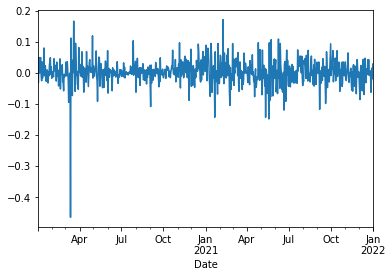
Looks nice.
For now we’ll leave it here and move on to looking at Correlation.
Data Analysis: Correlation
df = pdr.get_data_yahoo(['BTC-USD', 'ETH-USD'], start=datetime(2020, 1, 1), end=datetime(2022, 1, 1))
df.head()| Attributes | Adj Close | Close | High | Low | Open | Volume | ||||||
|---|---|---|---|---|---|---|---|---|---|---|---|---|
| Symbols | BTC-USD | ETH-USD | BTC-USD | ETH-USD | BTC-USD | ETH-USD | BTC-USD | ETH-USD | BTC-USD | ETH-USD | BTC-USD | ETH-USD |
| Date | ||||||||||||
| 2020-01-01 | 7200.174316 | 130.802002 | 7200.174316 | 130.802002 | 7254.330566 | 132.835358 | 7174.944336 | 129.198288 | 7194.892090 | 129.630661 | 18565664997 | 7935230330 |
| 2020-01-02 | 6985.470215 | 127.410179 | 6985.470215 | 127.410179 | 7212.155273 | 130.820038 | 6935.270020 | 126.954910 | 7202.551270 | 130.820038 | 20802083465 | 8032709256 |
| 2020-01-03 | 7344.884277 | 134.171707 | 7344.884277 | 134.171707 | 7413.715332 | 134.554016 | 6914.996094 | 126.490021 | 6984.428711 | 127.411263 | 28111481032 | 10476845358 |
| 2020-01-04 | 7410.656738 | 135.069366 | 7410.656738 | 135.069366 | 7427.385742 | 136.052719 | 7309.514160 | 133.040558 | 7345.375488 | 134.168518 | 18444271275 | 7430904515 |
| 2020-01-05 | 7411.317383 | 136.276779 | 7411.317383 | 136.276779 | 7544.497070 | 139.410202 | 7400.535645 | 135.045624 | 7410.451660 | 135.072098 | 19725074095 | 7526675353 |
And retrieving only the Close to have something to compare.
df = df['Close']
df.head()| Symbols | BTC-USD | ETH-USD |
|---|---|---|
| Date | ||
| 2020-01-01 | 7200.174316 | 130.802002 |
| 2020-01-02 | 6985.470215 | 127.410179 |
| 2020-01-03 | 7344.884277 | 134.171707 |
| 2020-01-04 | 7410.656738 | 135.069366 |
| 2020-01-05 | 7411.317383 | 136.276779 |
Let’s validate the correlation, e.g. how our values correlate to each other!
df.corr().style.background_gradient(cmap="Blues")| Symbols | BTC-USD | ETH-USD |
|---|---|---|
| Symbols | ||
| BTC-USD | 1.000000 | 0.903202 |
| ETH-USD | 0.903202 | 1.000000 |
The correlation looks pretty high… We can use seaborn to show even better data by adding the plots.
import seaborn as sns

sns.pairplot(df)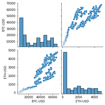
Indeed, looks very correlated! 🤩
What conclusions can we take from the above chart? Cryptocurrencies using daily data are indeed correlated, that is ETH prices depends on BTC and v.v.
This blog is getting close to its end, and as such we won’t go further in depth of this.
For the reader an excercise would be to predict the BTC price depending on ETH, which should be possible based on this correlation. We’ll go further into this later.
Data Analysis: Decomposition
Decomposing Time Series means that we try to find seasonality, trends and other things. This can be done using statsmodels which is a very impressive library that originally was done in R but now exists in Python.
from statsmodels.tsa.seasonal import seasonal_decompose

res = seasonal_decompose(df['BTC-USD'])
res.plot()
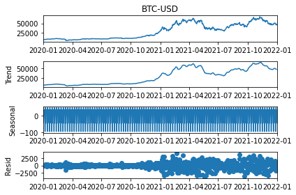
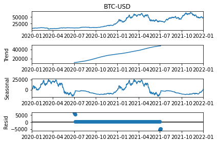
Looks nice and dandy! But we can modify this further by adding model and freq parameter to validate how it looks by decomposing either through model=multiplicative or additive, and updating the freq (period in the newest version) to decompose it based on different periods.
res = seasonal_decompose(df['BTC-USD'], model='additive', period=365) # Try weekly or monthly decomposition.
res.plot()
We’re now looking at our final data analysis step, Fast Fourier Transform, A.K.A. FFT!
Data Analysis: FFT
We’ll also add an Fast Fourier Transform which can show which frequencies the data “resets” at.
import numpy as np
import matplotlib.pyplot as plt

fft = np.fft.rfft(df['BTC-USD'])

plt.step(range(len(fft)), abs(fft))

plt.xscale('log')
plt.xlim([0.1, max(plt.xlim())])
plt.xticks([1, 365.2524], labels=['1/Year', '1/day'])
_ = plt.xlabel('Frequency (log scale)')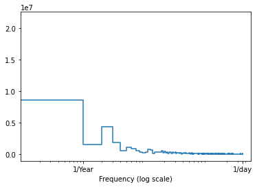
That’s it for this time. Make sure to view part 2 if you want to start predicting some data, and in part 3 we’ll do the final prediction where we’ll look at different forecast horizons!
To learn more about Time Series and how one can analyze them please view the other parts,